Footsteps2
Early years learning journey software
Overview
An Early Years Foundation Stage (EYFS) tracking application that gives nurseries and parents a better insight into a child’s development


Role
UX UI Design
Tools
Adobe XD
Illustrator
Zeplin
Miro
Date
2016 - 2019
Summary
An Early Years Foundation Stage (EYFS) tracking application that gives nurseries and parents a better insight into a child’s development. It helps nurseries quickly record progress and capture any supporting photos or videos when observing a child’s play, whilst safeguarding their children with state-of-the-art photo tagging and blurring feature, helping to ensure you are GDPR compliant. It was a greenfield project designed to replace a legacy product which was deemed no longer fit for purpose.
I led design and collaborated with a Product Manager, Business Analyst and a small team of developers and QA.
Challenge
The pre-school sector have been slow to adopt software that could reduce the time spent observing and tracking the children in their care. Many businesses still rely on pen and paper as the method of recording collected data obtained in the learning and development of children.
Goal
The main goal was to create an application that would facilitate the recording of meaningful, detailed and essential EYFS observations. Thus saving hours of time, reducing the workload and allowing more time to be spent with the children.
Key features that were delivered
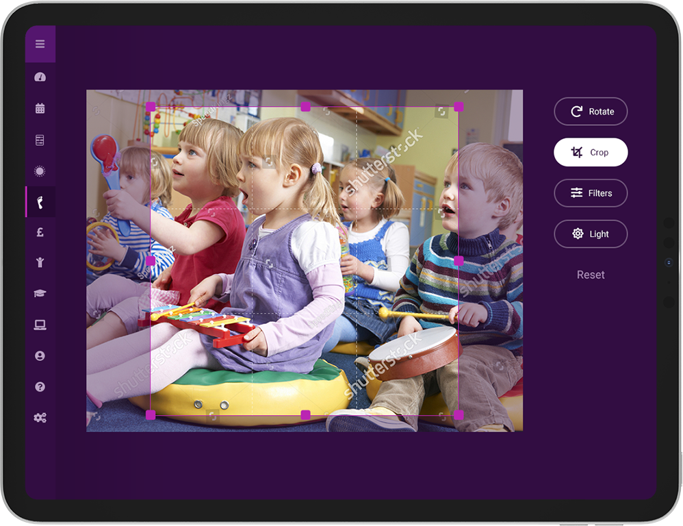
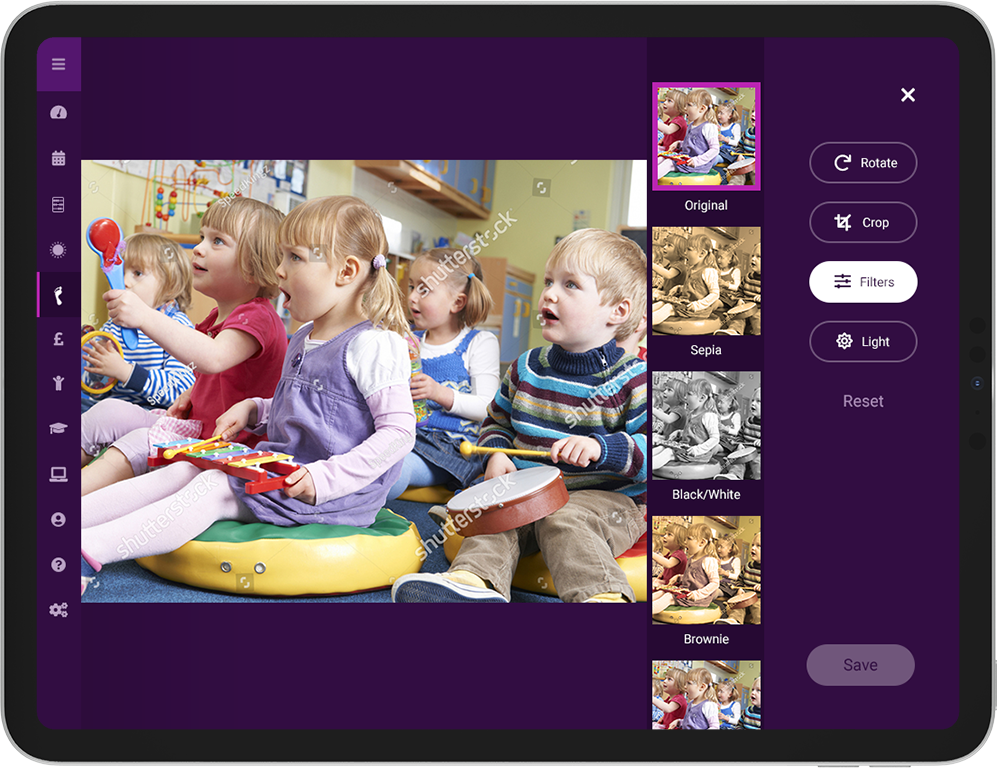
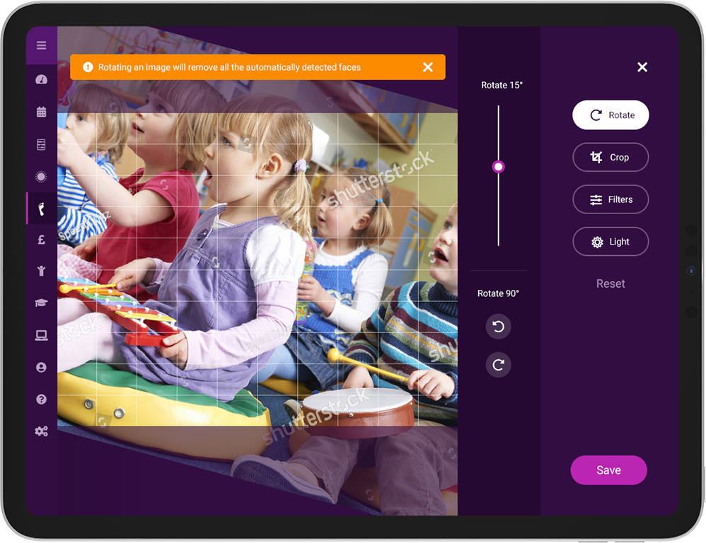
Unique facial detection, photo tagging and blurring technology
- GDPR compliant
- Useful photo-editing tools
- Easily upload observations with photos to share with parents and carers.

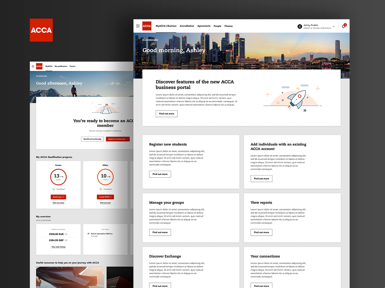
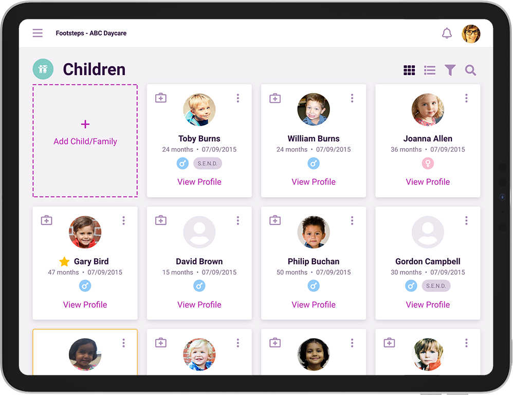
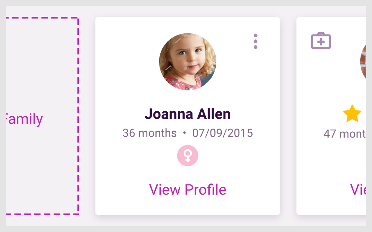
The ability to view all children easily
- Easy to read card view shows SEND, age, date of birth, medical conditions and allergies
- Sort quickly with list view by key person, gender, date of birth, start/leave date, age and name
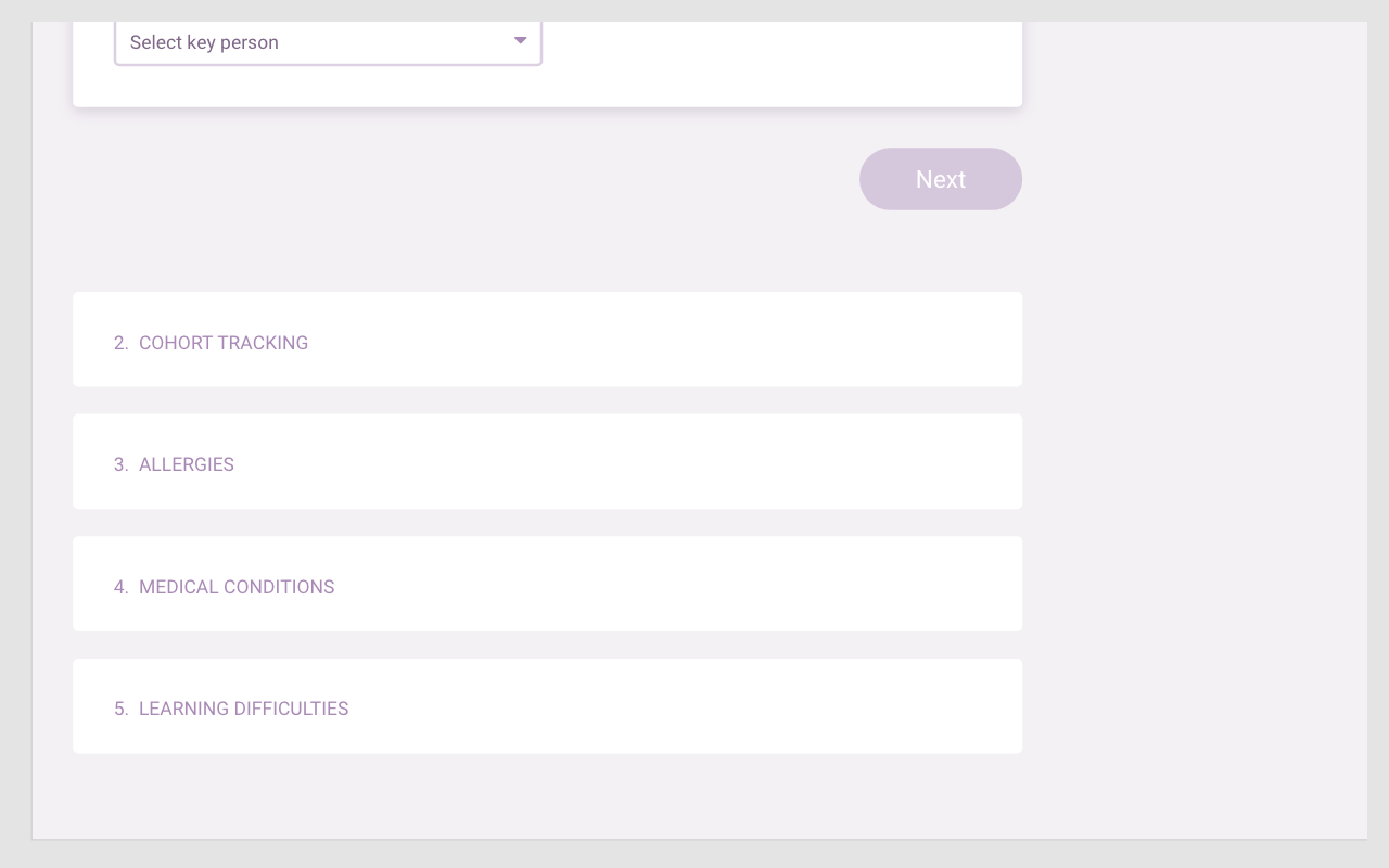
- View progress for groups of children with cohort tracking.
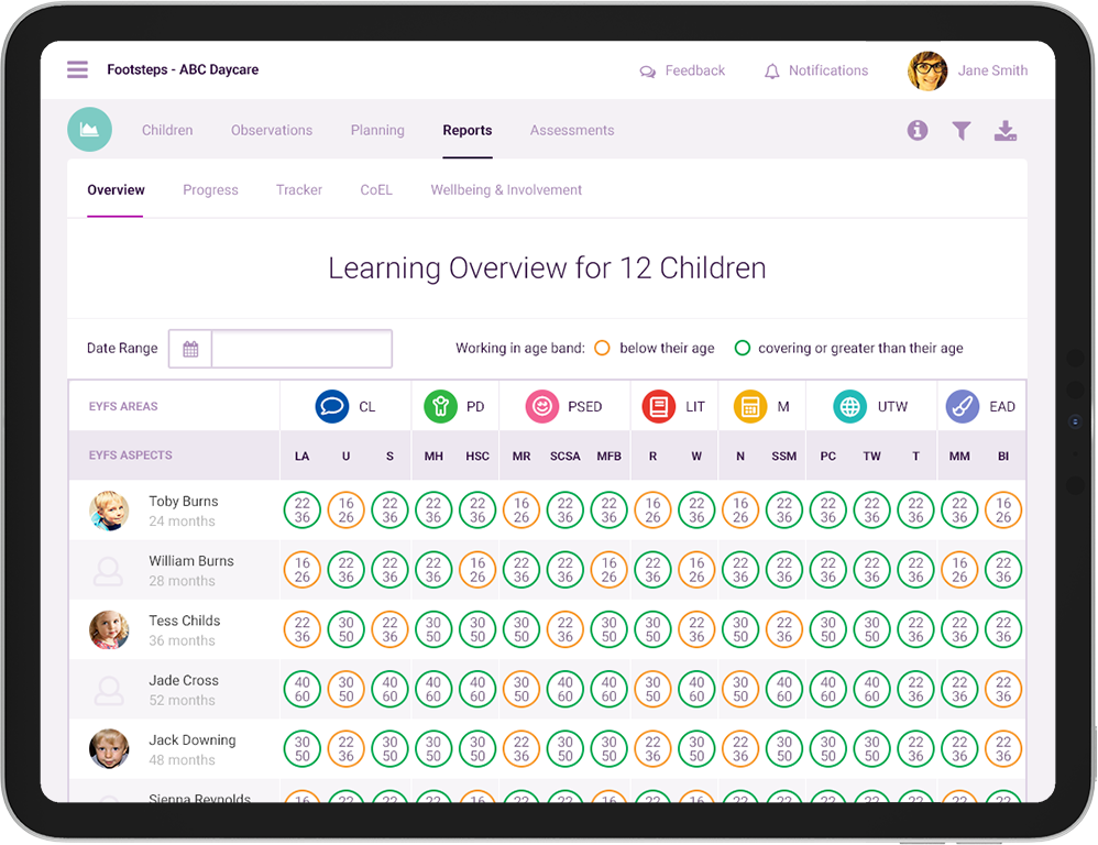
Improved tracking and reporting
- Improved tracking and reporting assists preparation for an Ofsted visit
- Multiple user-friendly report screens
- Comprehensive progress tracking
- Time-saving group reporting
- Easy provision of documentation to Ofsted
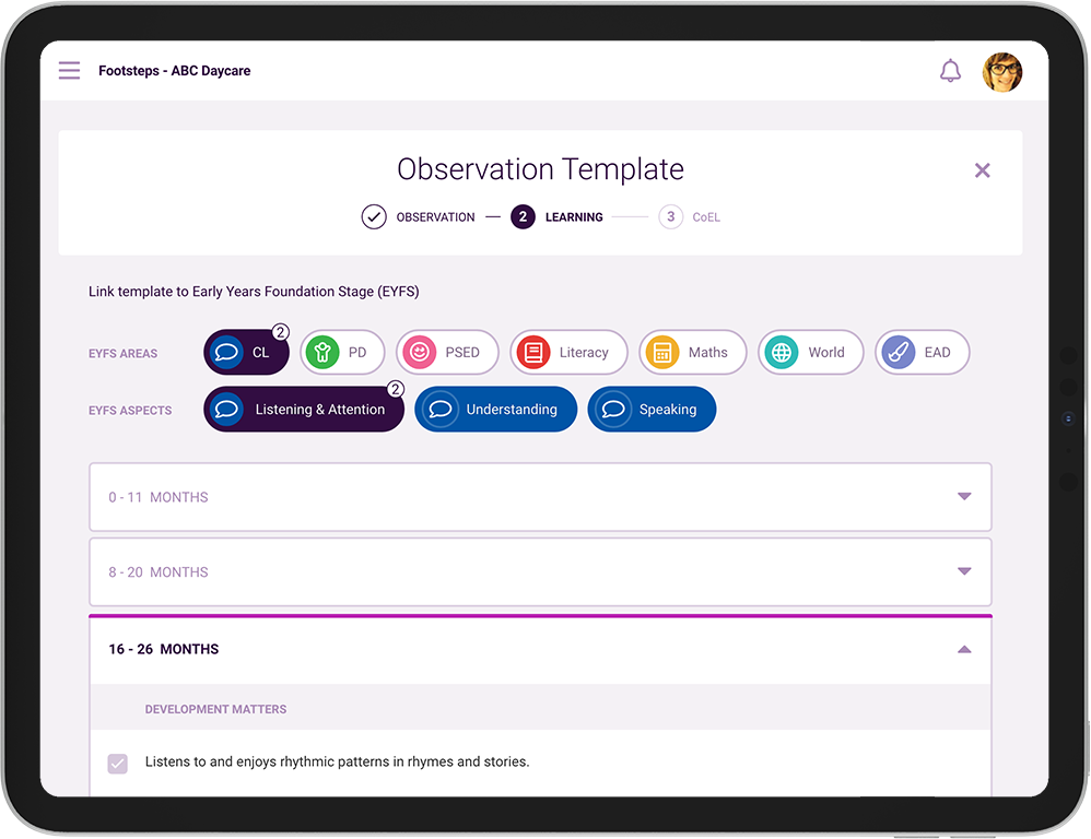
Record and track a childs progress through observations
- Give parents and carers a better insight into their child’s development
- Maintain accurate tracking with new baseline observations
- Record CoEL against aspects of each child’s development
- Follow wellbeing and involvement with Leuven Scales
- Observations can be reviewed by all users
The solution
Process
Utilising primary and secondary research, best practices and key design principles.
The project was supposed to be launched as an MVP and updated as new features were ready for deployment, but this opportunity was missed by stakeholders. The business had aspirations of delivering the project via Agile, some aspects were but mostly being delivered via Waterfall.
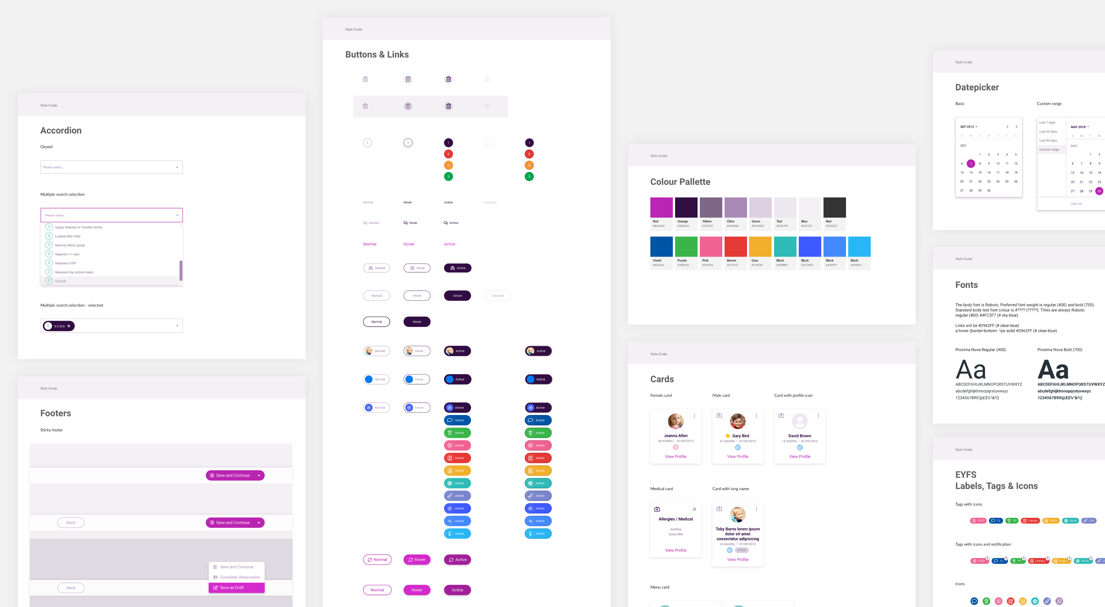
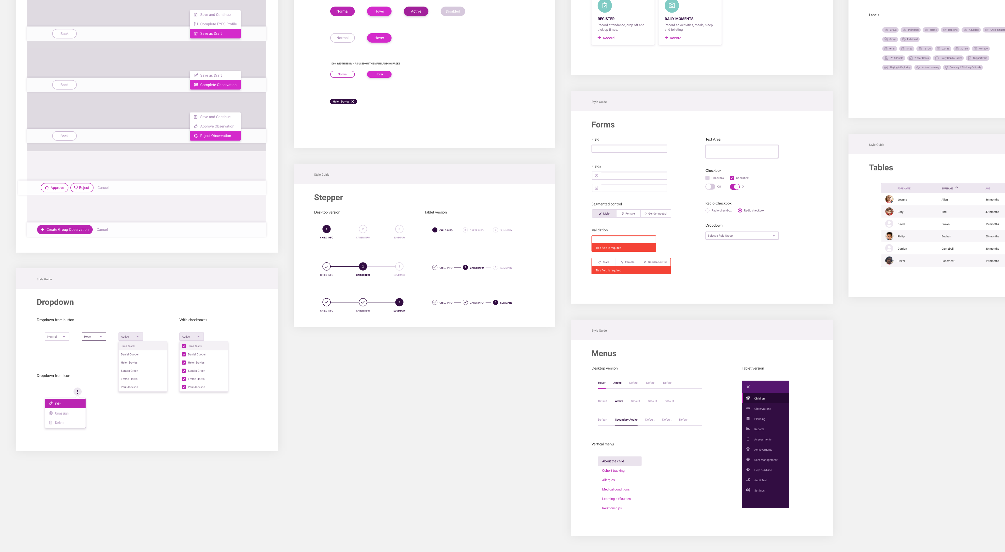
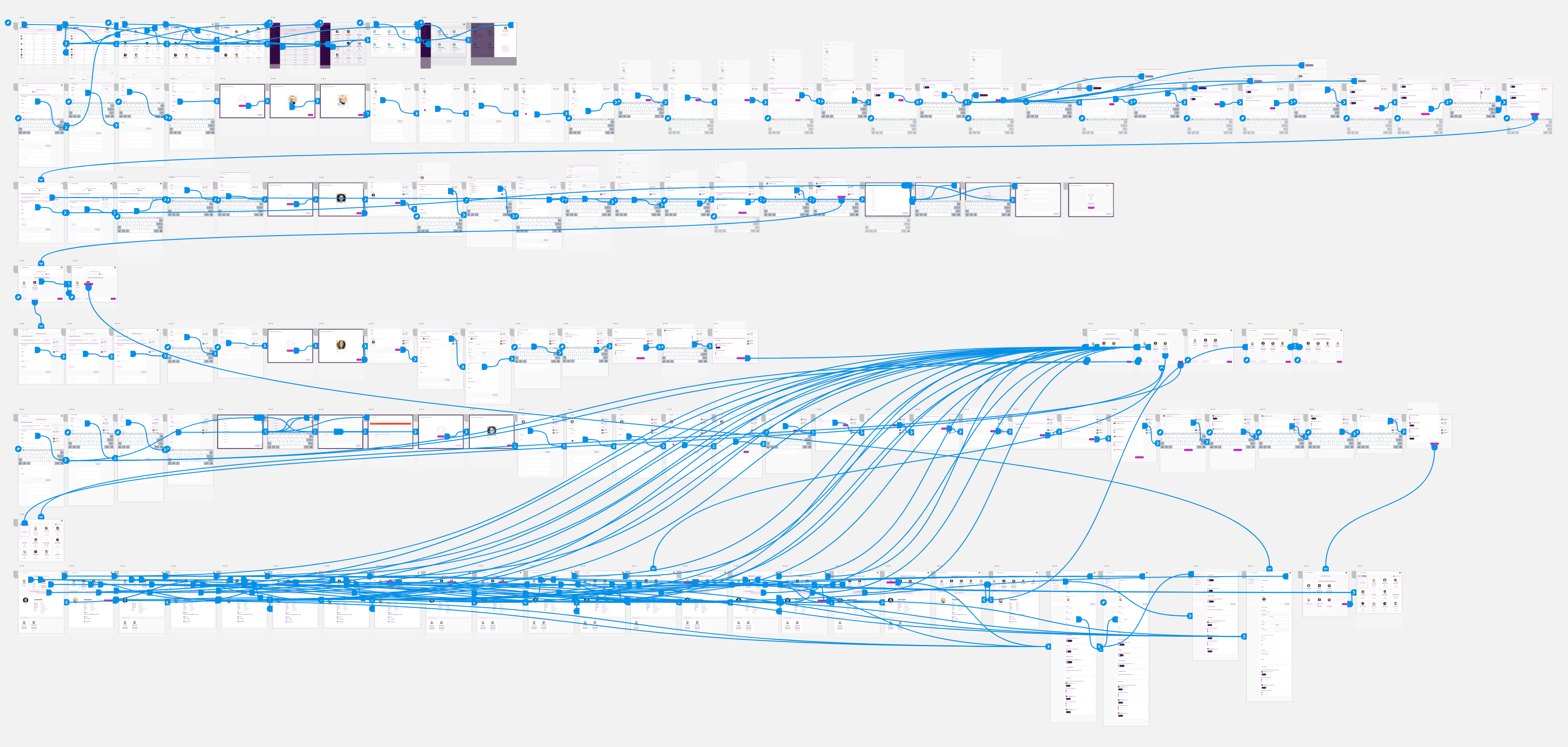
Building a component library
When I joined the team, there was no design library in place. The company needed a common design language setting to deliver a cohesive and consistent experience. I set up the assets that were required, building a sympathetic colour palette, icons library, UI pattern building blocks for the interfaces and all of this to improve the product’s user experience. Development was in Angular.
I proposed a simple-looking user interface when designing the component library, this has several advantages.
- Ease of Use: A simple UI is typically more intuitive and easier for users to understand and navigate. This reduces the learning curve and allows users to quickly familiarize themselves with the interface.
- Consistency: A simple design language promotes consistency across different components within the library. Consistency is crucial for a cohesive user experience, making it easier for users to predict how different components will behave and look.
- Scalability: Simple designs are often more scalable. They can be adapted and extended more easily as the library evolves, without significantly altering the overall aesthetic or breaking existing patterns.
- Accessibility: Simple designs tend to be more accessible, as they prioritise clarity and readability. This benefits users with disabilities or those using assistive technologies.
- Faster Development: Building simpler components can speed up the development process. It reduces the complexity of coding and debugging, enabling faster iteration and deployment of new features.
- Focus on Functionality: A minimalist UI allows users to focus on the functionality of the components rather than getting distracted by unnecessary visual elements. It directs attention to the core purpose of the components.
- Adaptability: Simple designs often age better and have a timeless quality. They are less likely to become quickly outdated or require frequent redesigns as design trends change.
Method example
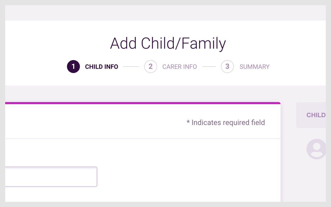
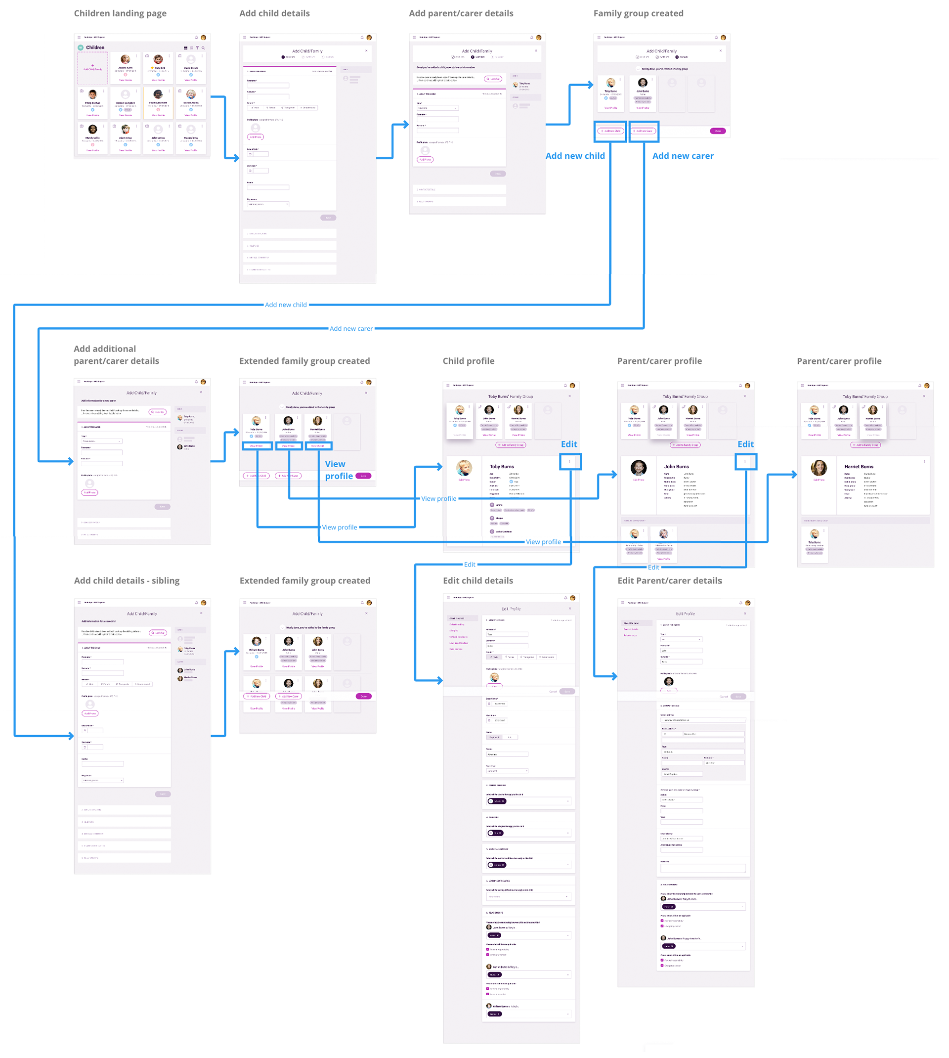
Add a new child and parent/carer
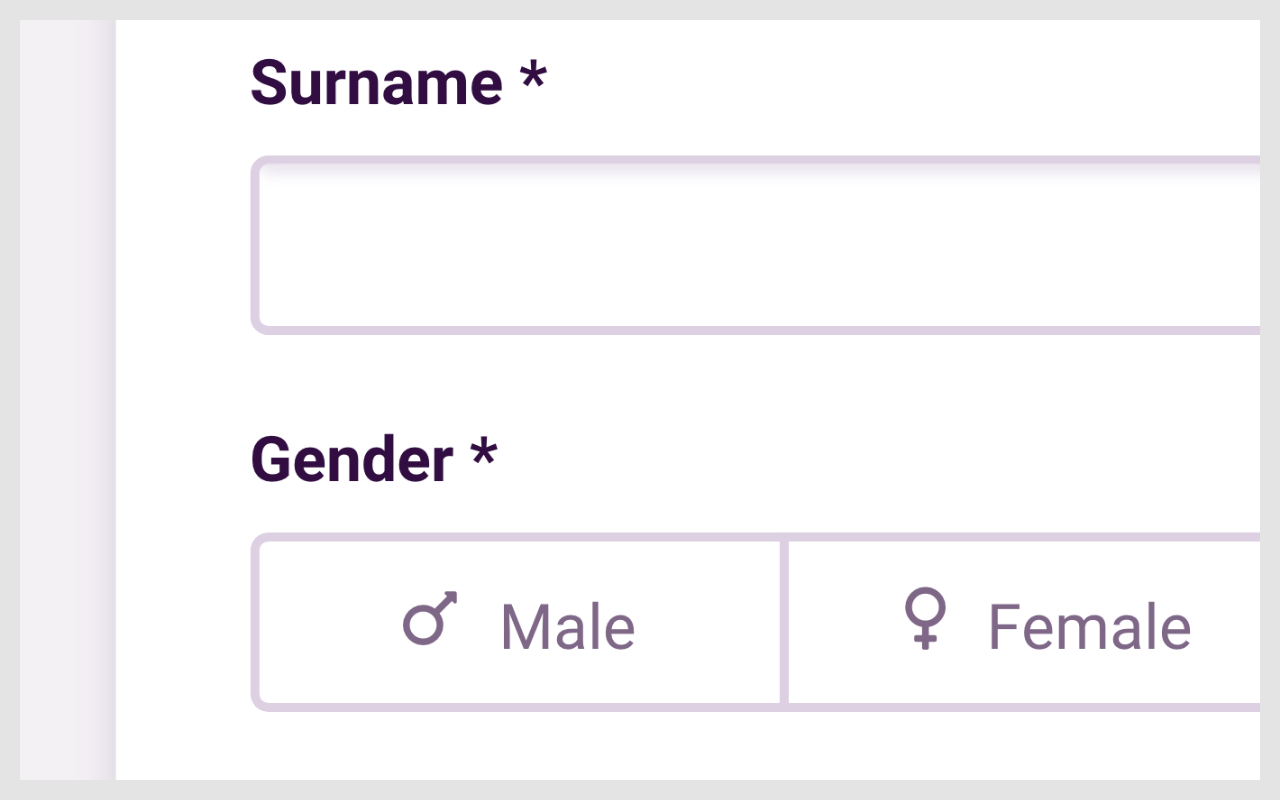
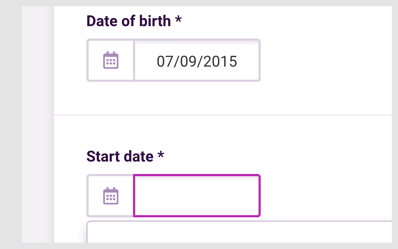
For this example, I'm going to use the task of adding a new child into the system, collecting key details about the child. A child can only be added if a parent or carer is added at the same time (no 'orphaned' children wanted in the system). All the collected data for the parent/carer, forms a new family entry into the system. It's a long form which can cause all kinds of frustration and needs consideration to improve usability. Best practices will help with making it less intimidating and easier to complete.
Empathise and Define
Stakeholder interviews gave me a good understanding of the business aspirations. Talking to customer support highlighted users feedback. I also worked closely with a business analyst and as a team set goals for the project.
I conducted competitor analysis and research to see what the competitors were doing. It wasn’t easy and not that much was gained as most were portal based systems and needed an account creation to access the system and this wasn’t possible. I did find out that most of the as-is processes were labour intensive, everything was printed on handout forms.
I discovered that in a busy nursery setting, it can be a challenge to focus on providing outstanding childcare day to day, while continuing to record meaningful, detailed and essential EYFS observations.
Ideate and iterate
When starting a new feature, I would go through multiple rounds of brainstorming, sketching, testing and iterating, to understand what works and what not and finalise the design.
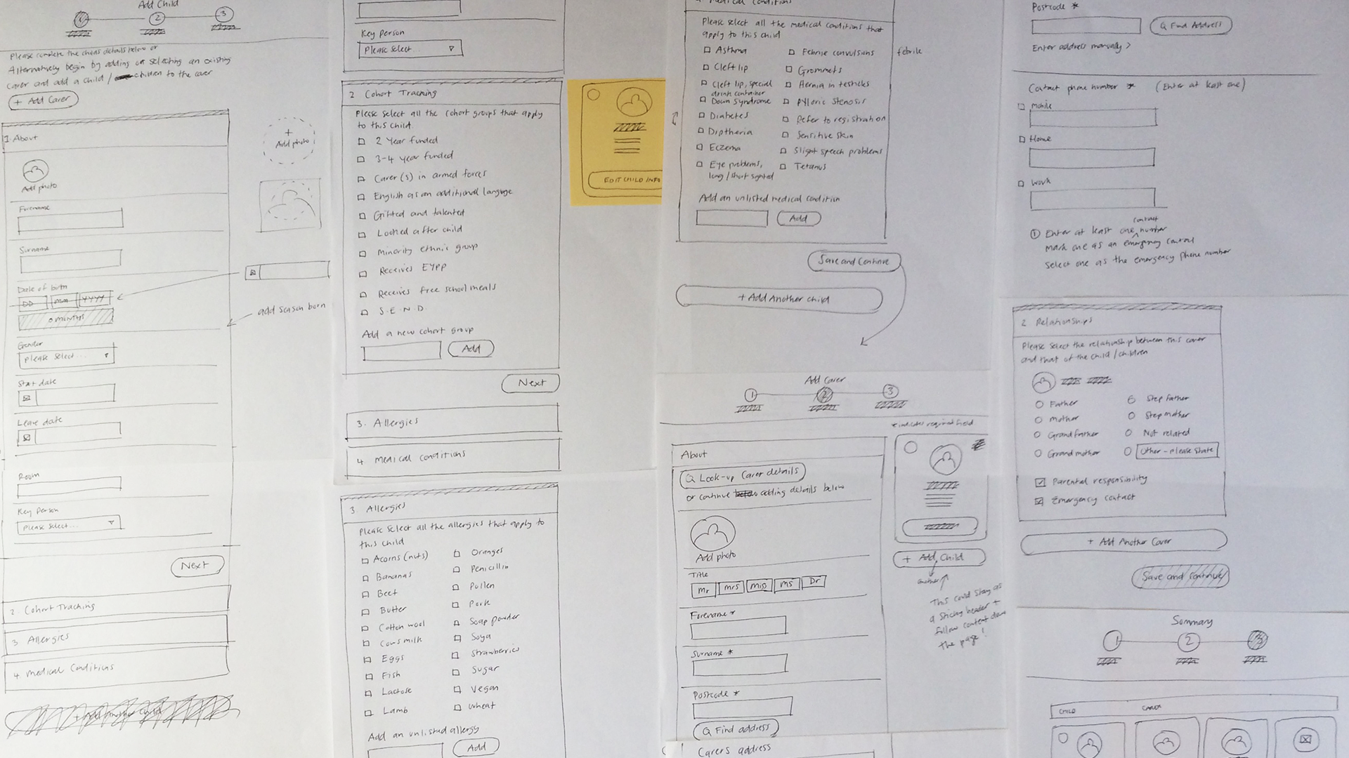
Wireframe sketches
Increasing fidelity
From initial sketches and then a low fidelity wireframe. If appropriate I would build a mid-fidelity prototype to test internally and to gain buy in of the concept.
Medium fidelity wireframe
Test
User testing
Who: colleagues
How: I conducted my own guerrilla user tests because research resources were unavailable. Following an iterative process this led onto a high-fidelity prototype for testing and subsequent approval.
The tests allowed me to gain good insights, especially for long forms. What have I learned?
- Group questions into sections
Sort questions into manageable chunks. The user can map where they are in their process of completing the form.
- Make location visible
You want to show where the person filling out the form is in the process. I ended up using a stepper to indicate their location. Highlighting the active section, showing which sections are complete.
- Using a single column
Eye tracking studies have shown as well as through A/B tests, show single columns to be more usable.
- Use inline form-field validation
Inline validation is a beautiful way to find, alert, and correct errors in real time. Instead of waiting until users press “submit,” they learn right away what went wrong.
Medium fidelity prototype
Design
After ideation, wireframes, standardising UI components, user flow, I set about creating high fidelity visuals. I researched and followed best practices and included many new learnings from previous iterations into the designs.
Ghost UI elements, representing pending UI
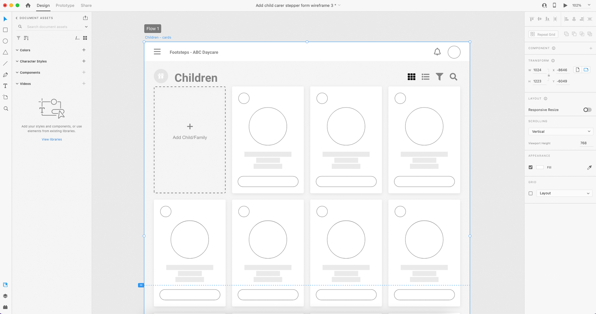
An easy to read card
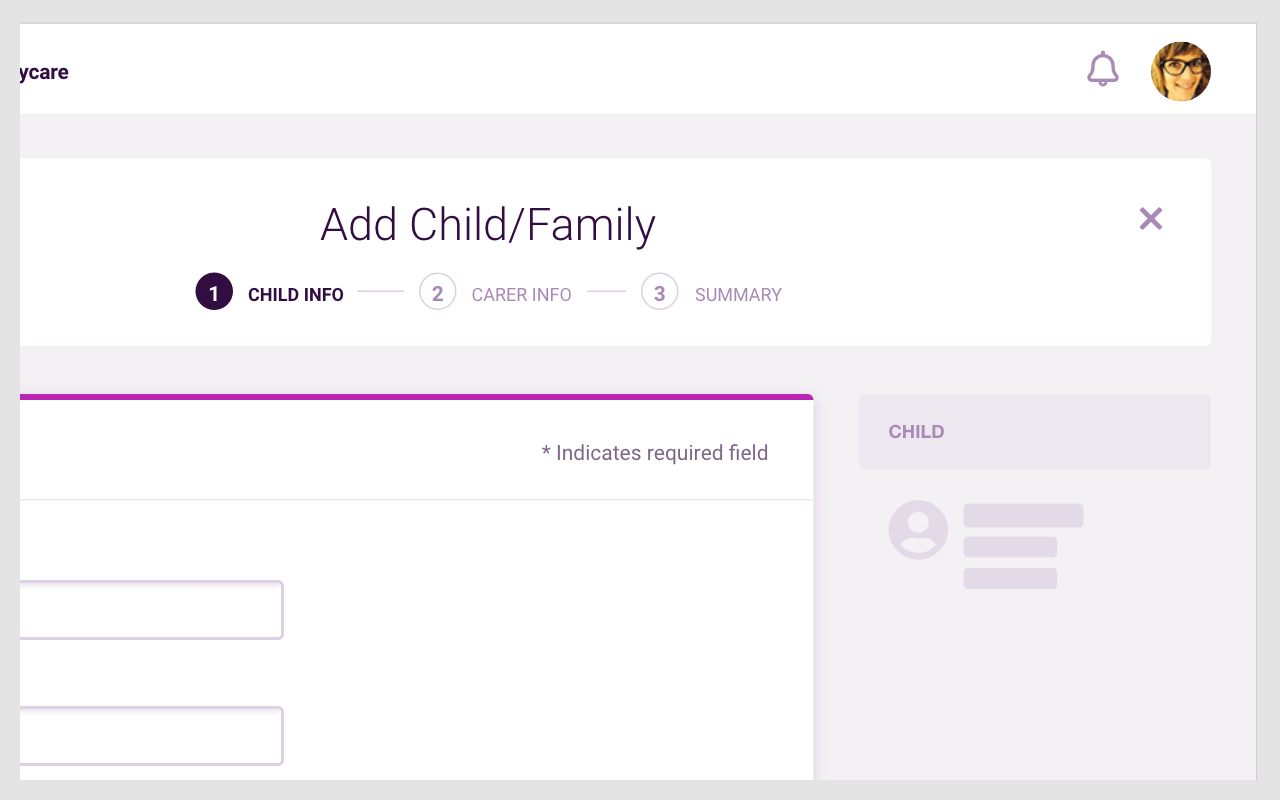
Grouping questions into sections
Indication of progress for multiple-step forms
Have the form as a single column
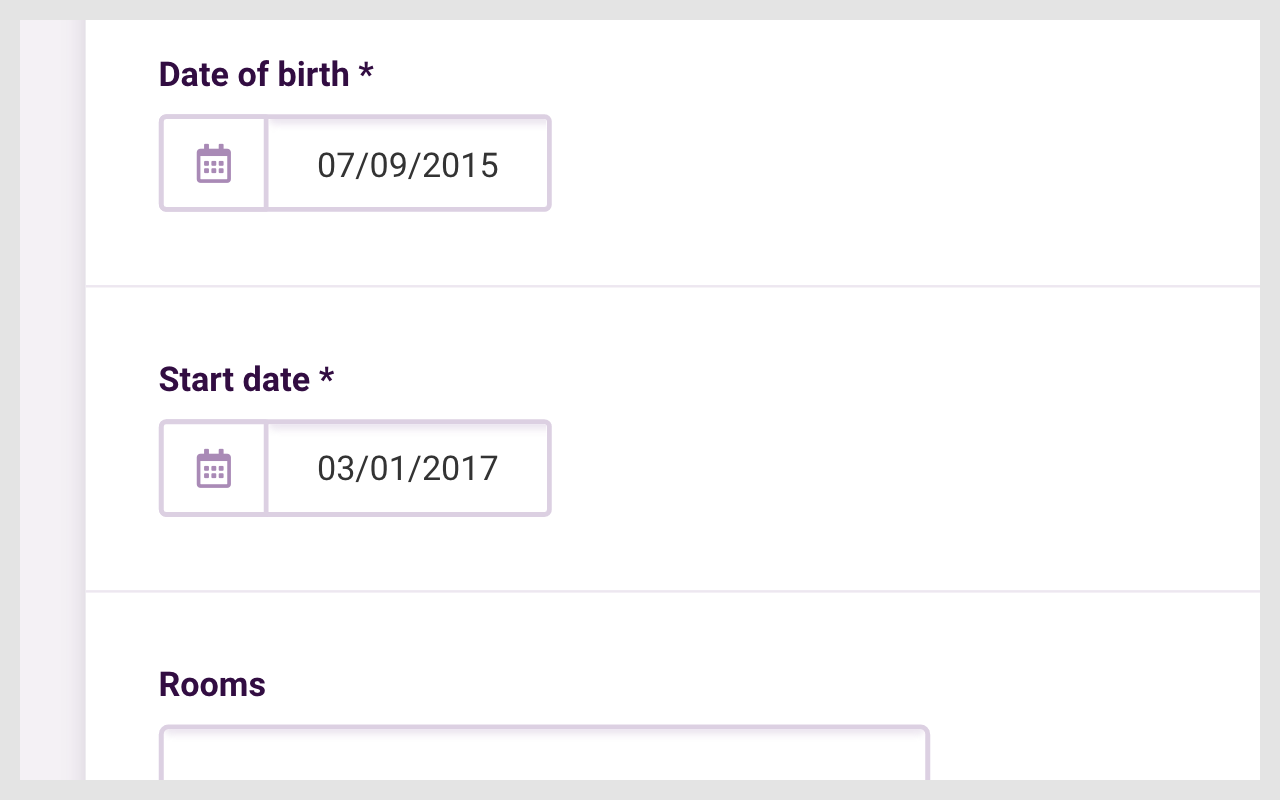
Using a short label on the form field
Match field length and structure to the intended input
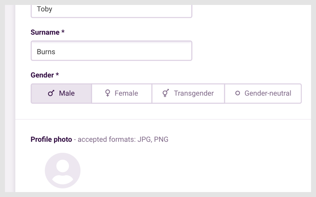
Showing all selection options if < 6
Prototype
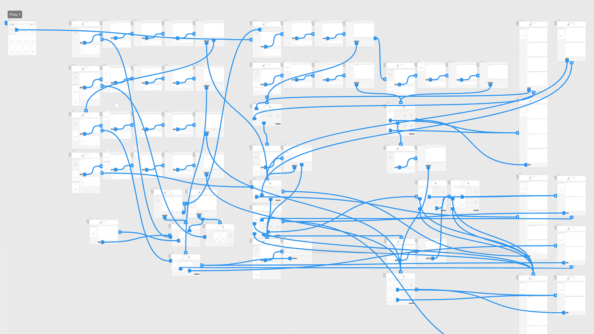
'Add a new child and parent/carer' prototype is included below. I was able to utilise the features in XD to accurately communicate the motion design and illustrate subtle but necessary interactions, transitions and flow.
To reset the prototype, please view it on the Adobe website
Adobe XD prototype
Method example
Illustration
Enhancing the experience and creating positive mental snapshots for people that use the software. In UX psychology this is called the ‘Peak-end rule’, it’s an understanding of how emotion impacts user experience.
After initial sketches and several iterations, this 'no internet' modal includes an illustration I created to lift a potential negative state.
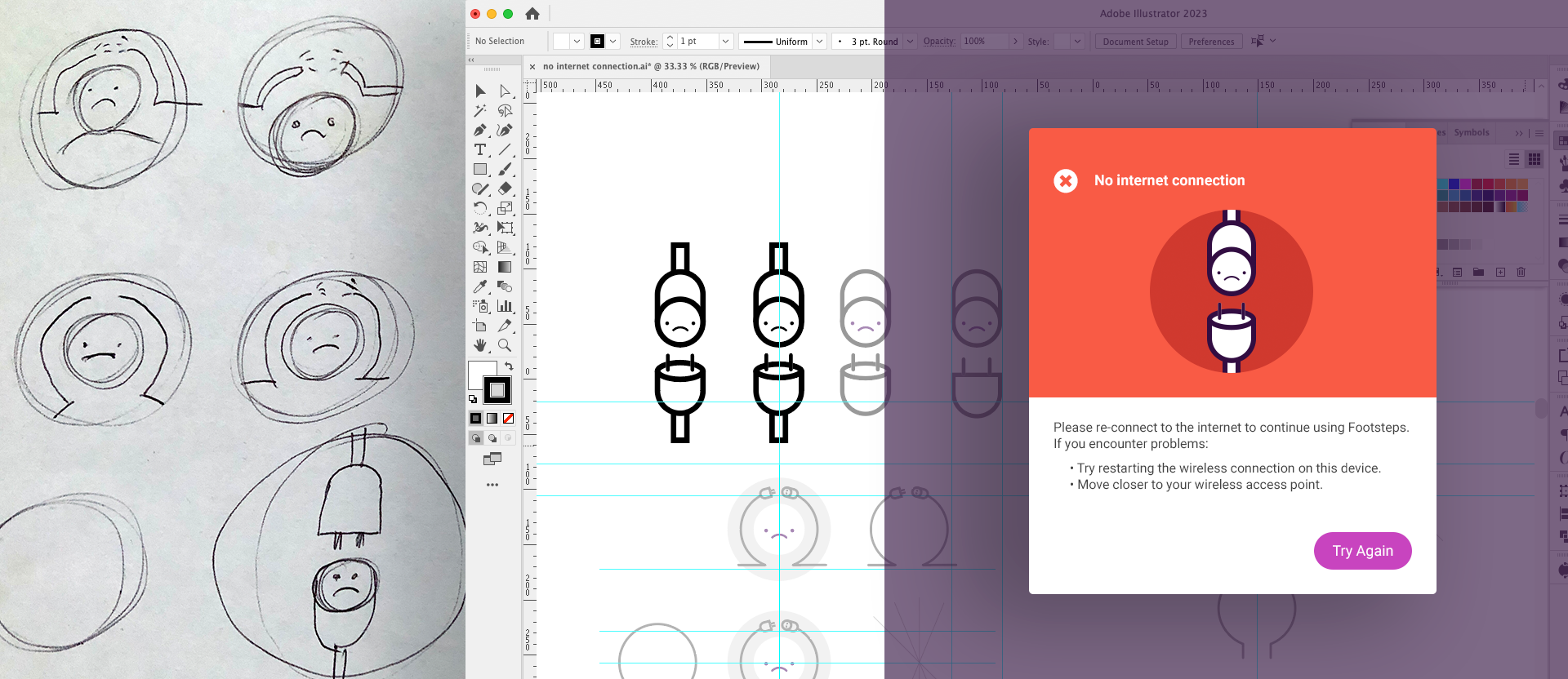
From sketches to artwork
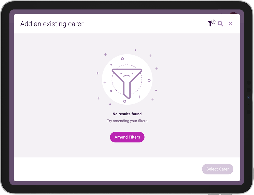
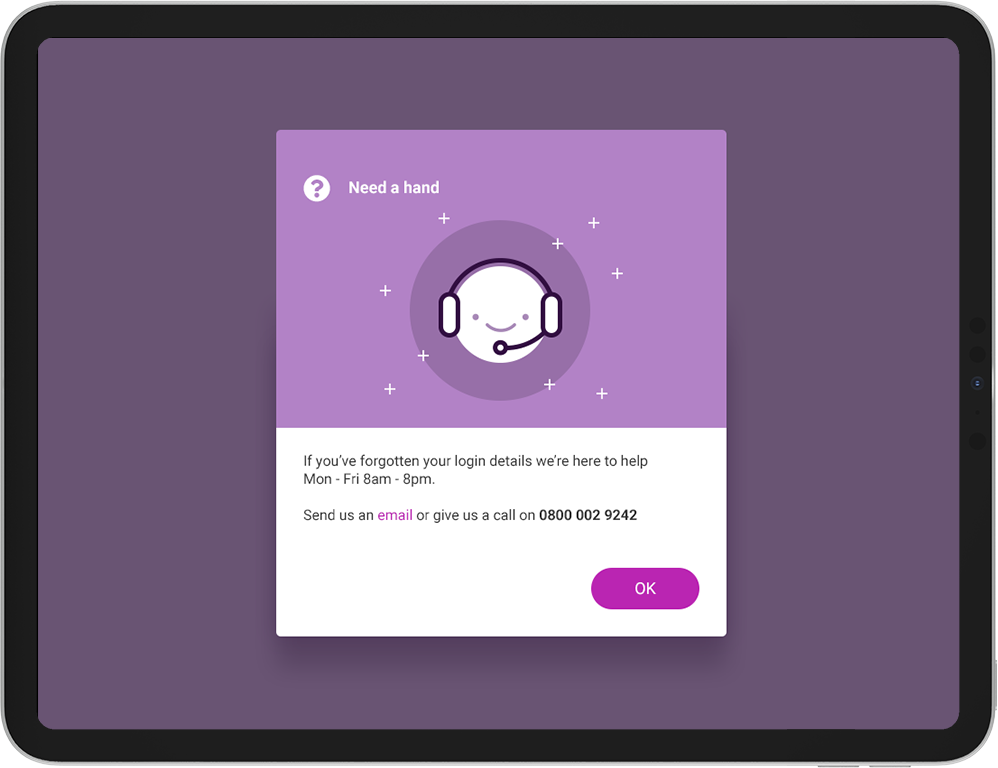
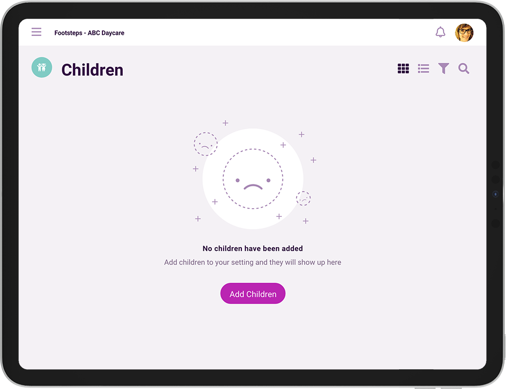
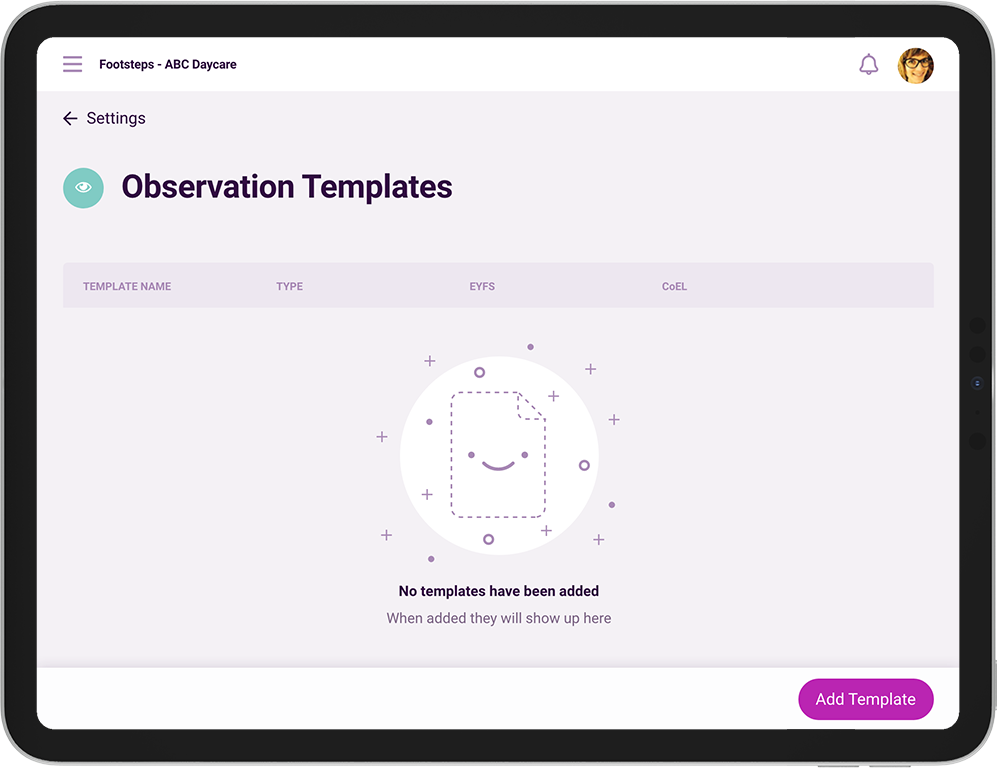
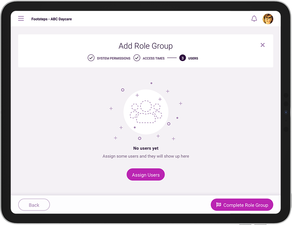
I decided to add a touch of brand character through illustration, using these on empty states and negative states and helping to defuse what could potentially be a stressful moment and give a negative impression to the experience.
Adding illustration across the platform
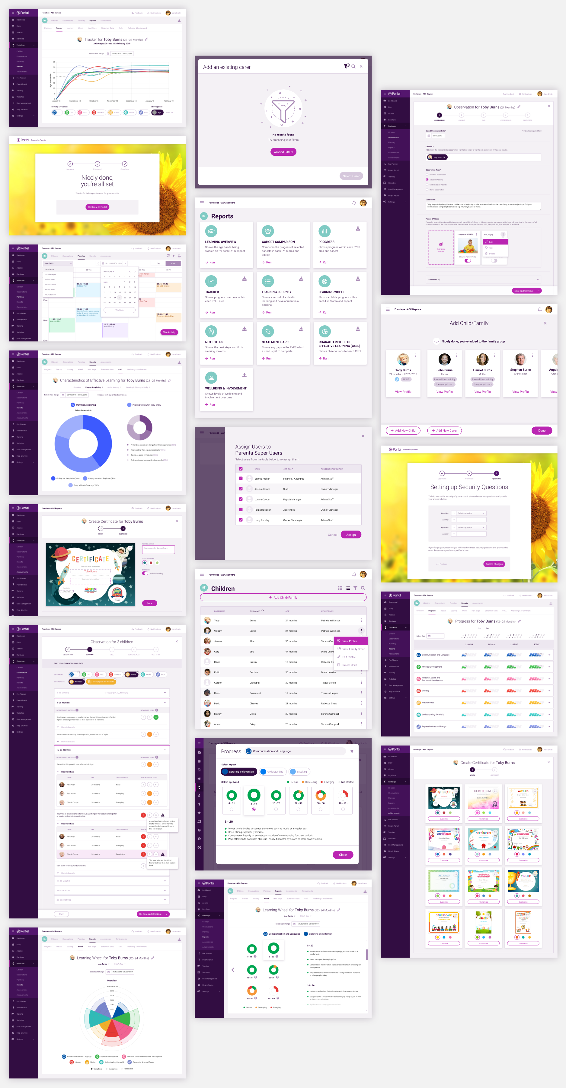
Sample of final screens
High fidelity responsive visual specification for desktop and tablet.
Reflection
The new product has been well received with customers and the goal was met to deliver a product that facilitates and saves time whilst making EYFS observations, moving customers from pen and paper to digital.
I’ve grown so much more as a designer since this project, as I hoped, I now have a much better understanding of UX and product delivery.
The business and stakeholders wanted to deliver an MVP but lacked strategy and experience on how to deliver this. There was an aspiration for Agile development but it ended up being Waterfall.
I wasn't able to conduct qualitative and quantitative testing with real customers which would have bought up insights that would have helped with the product development. This has made it difficult to help product owners make evidence based decisions with ongoing features. Running small workshops with customers to discuss feature desirability would have been an effective way to expose important unknowns and encourage directional research.
MORE PROJECTS