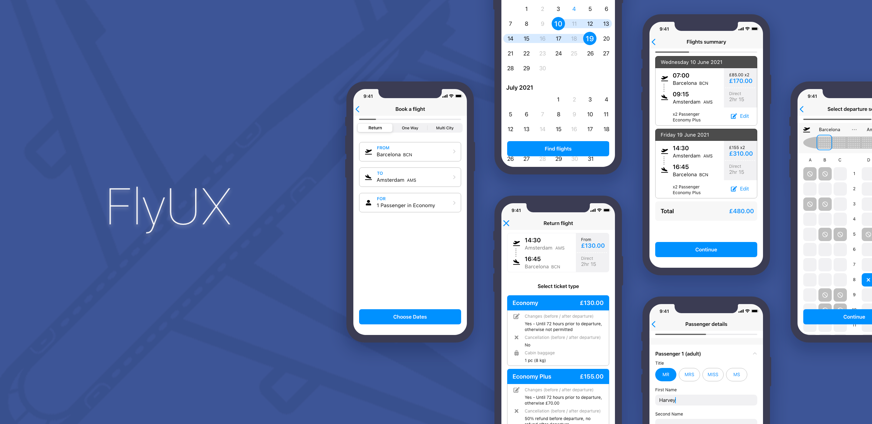
Fly UX
Flight booking app
Overview
Flight booking mobile app designed for a fictional airline and part of the requirement for a Professional Diploma in UX Design from the UX Design Institute
Role
UX UI Design
Tools
Adobe XD
Miro
Reflector 3
Photoshop
Indesign
Date
2020 - 2021
Summary
This case study consists of course work completed for the Professional Diploma in UX design from Glasgow Caledonian University and run by the UX Design Institute.
The challenge
The client is a start-up airline called Fly UX. They’re looking to create an online experience that is fast, easy, and intuitive, one that’s based on a deep understanding of their target users. An airline was chosen because the industry is traditionally packed full of bad design. It’s a space that clearly needs UX.
The goals
- to develop a clear understanding of the user-experience design process
- to recognise that UX Design is a problem-solving discipline focused on building technology products that will solve problems for end-users
- to become aware of the risks of traditional software development and its pitfalls, and why and how UX design can mitigate these risks with a different approach
- to learn that UX is a research-based discipline, whereby design teams make decisions based on research conducted with end-users, and the insights gained from that research.
Process
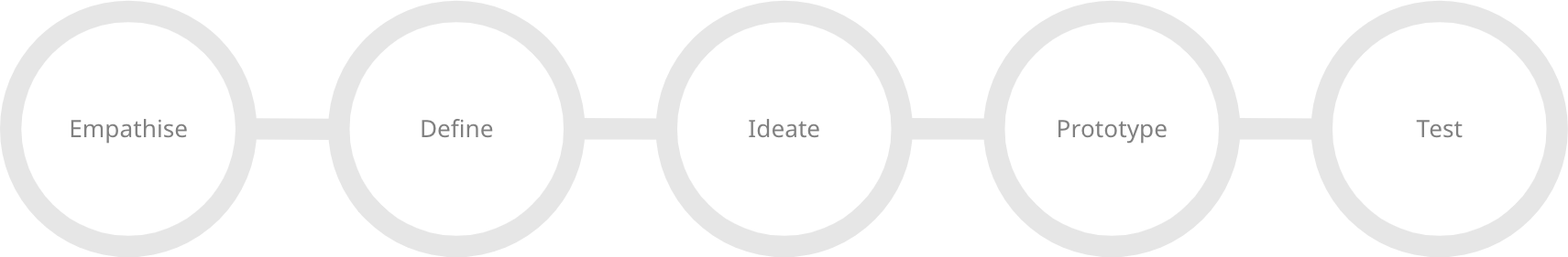
Research
Through user research I was able to identify problems with the experience of using a mobile app for a flight booking process: how users search for, find and select flights online. The processes I used were:
- Competitive benchmarking
- Depth interview
- Usability test
- Note-taking
Competitive benchmarking
Research began with competitive benchmarking, I’ve done this before with previous projects. I selected four airlines based on their stature in the market. Two airlines were small like Fly UX and two were established carriers that Fly UX would hope to be in the future. My goal was to use heuristic principles as a guide to discovering how competitors solve similar UX problems, and highlight best practices as well as practices to avoid. I also wanted to understand the conventions of a booking process so I could understand what my users would expect.
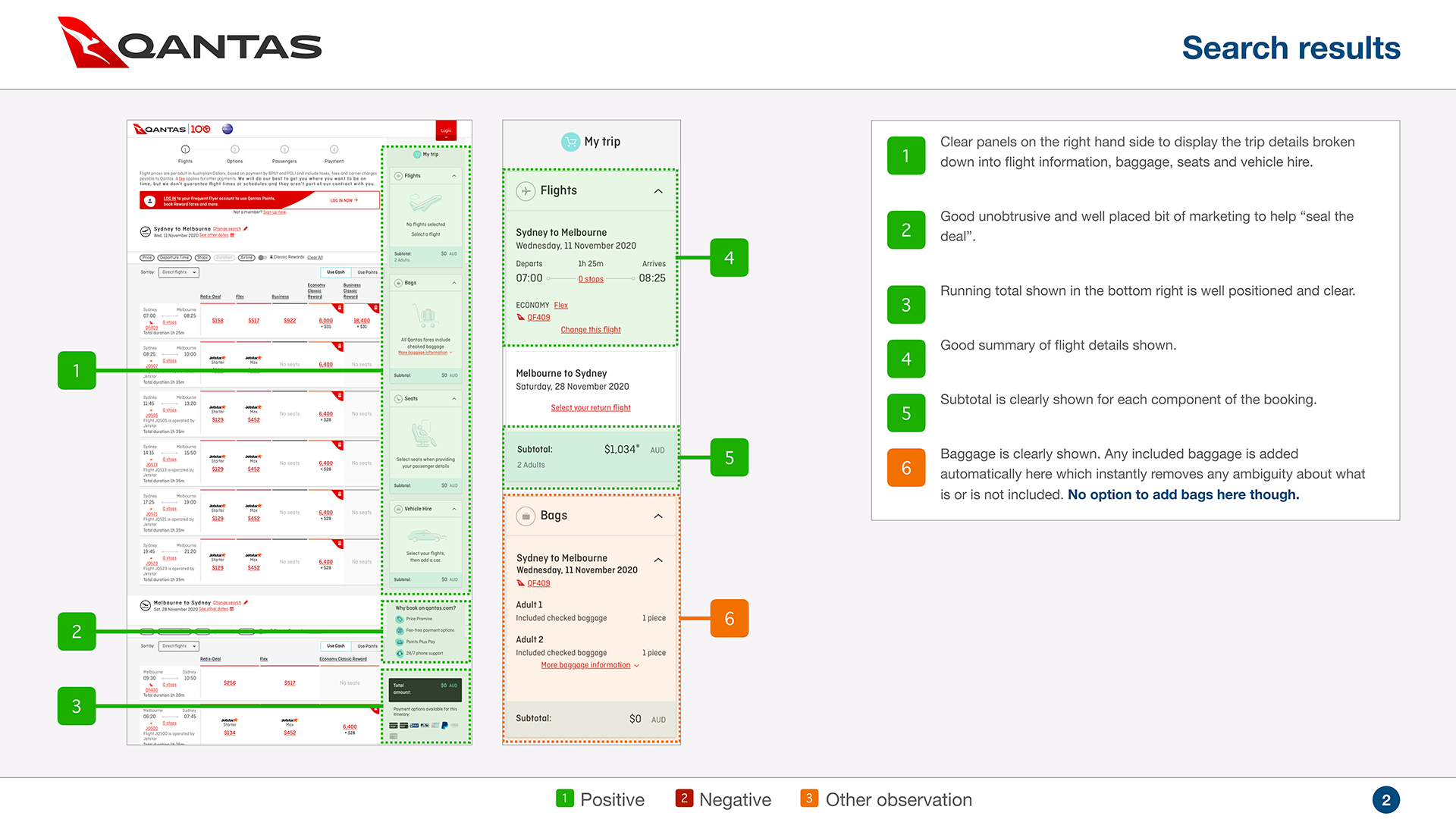
The benchmarking took four aspects to consider:
- Selecting flight details
How easy can I select the destination, flight dates, and the number of passengers
- Booking details
Is it clear to me what I have selected and booked before I make my flight final?
- Upsell opportunities
How smooth are the upsell options presented without being annoying
- Payments page
How are payment methods presented and what is the final price including all costs
From the benchmarking, I discovered the following pain points:
- Airlines were not clear with their pricing, connecting flights, and luggage limits
- One of them had an interface that was cluttered and was difficult to navigate
- Information is often duplicated.
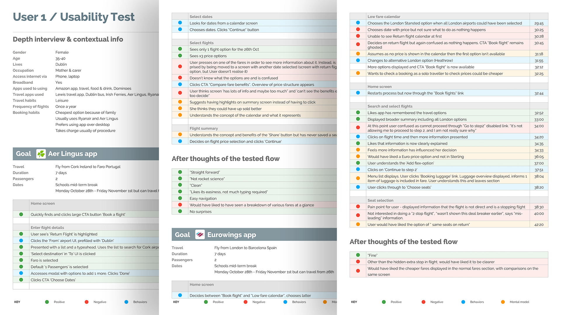
Depth interview
I’d organised a customer research session to get qualitative data with a participant. Due to COVID-19 restrictions, I held the meeting over Zoom. They would be doing comparison testing of airline flight booking processes on iOS mobile apps and I wanted to get qualitative data from the participant.
I drafted an interview script that was focused on this user’s previous experience with booking flights.
- Did they compare prices?
- What was most important when booking the flight?
- How many people were travelling with you?
- I wanted to understand how they shared information about flights if they were travelling as part of a group?
Usability test
After the interview, I asked the participant to complete a simple booking task on two separate airline mobile apps. I wanted to see what was falling between the cracks to better understand what they need to achieve their goal, what the user might not remember to tell me and what they might not even realise is a problem. I created a script that I loosely stuck to, asking open questions that I felt would give me rich answers.
Note taking
The depth interview and usability test session provided insights into the goals, behaviour, and pain points of the participant when booking a flight. Through note-taking I highlighted the key insights from both sessions: anything that would help in making decisions about the design later on.
Analysis
I've learned that analysis of research data is needed to make sense of large volumes of raw data. This creates true understanding of the problems needing to be solved. I produced an Affinity diagram to sort through the large volumes of data and get to the root of the findings. Then a Customer journey map to define the high-level steps in the journey.
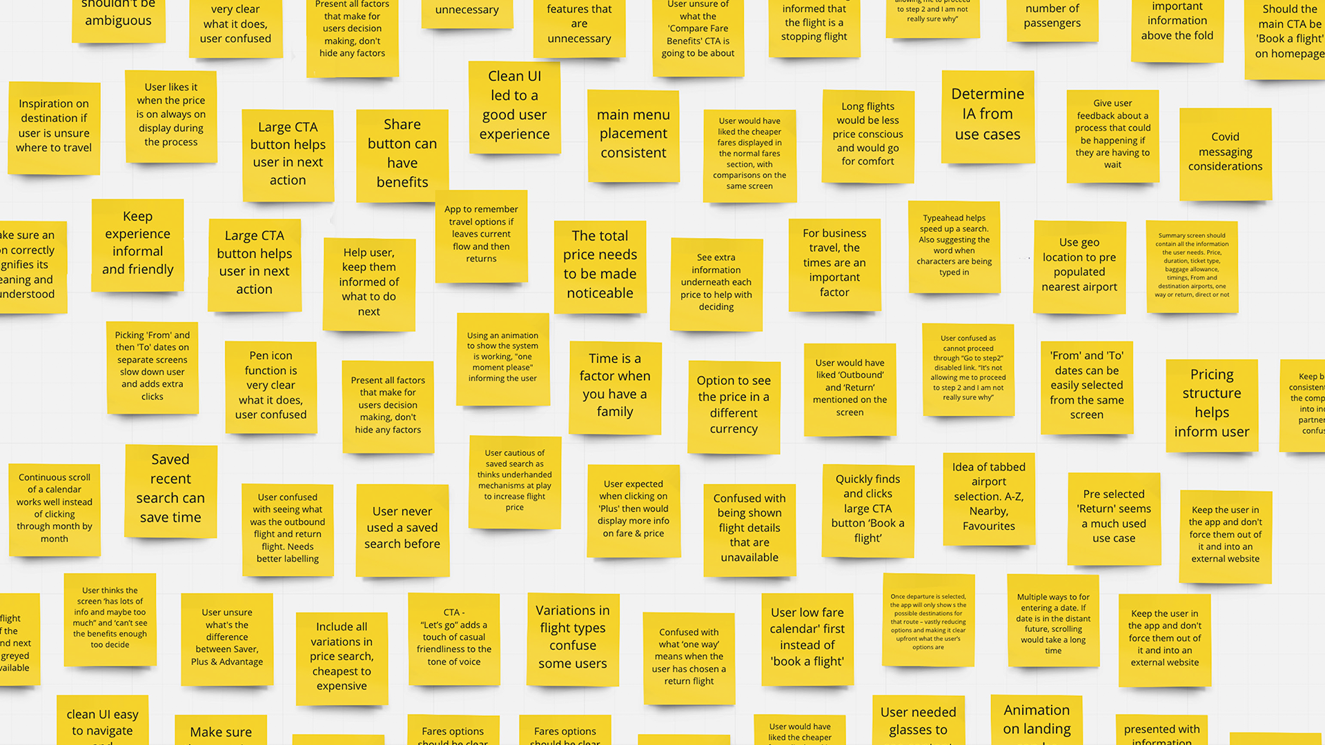
Affinity diagram
From unstructured user data I turned the qualitative research data into meaningful insights. I conducted the affinity diagramming session using Miro, describing the current user experience: goals, behaviours, pain points, mental models, and contextual information.
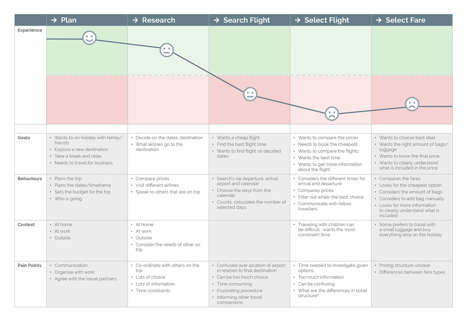
Customer journey map
Producing a customer journey map meant I was putting even more structure on the analysis of the research data and translating research data into a structured document.
Design
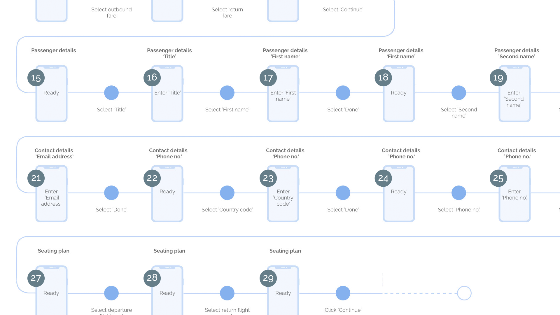
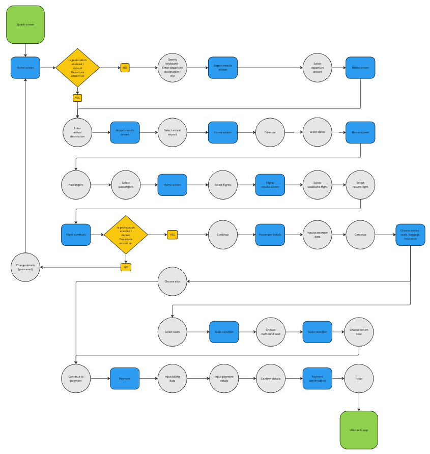
Flow diagram
Now moving onto the design phase and defining a high-level flow and for one primary use case. I produced a flow diagram that represents each interaction on screen or state. The flow would be from the homepage up to and including the seat selection.
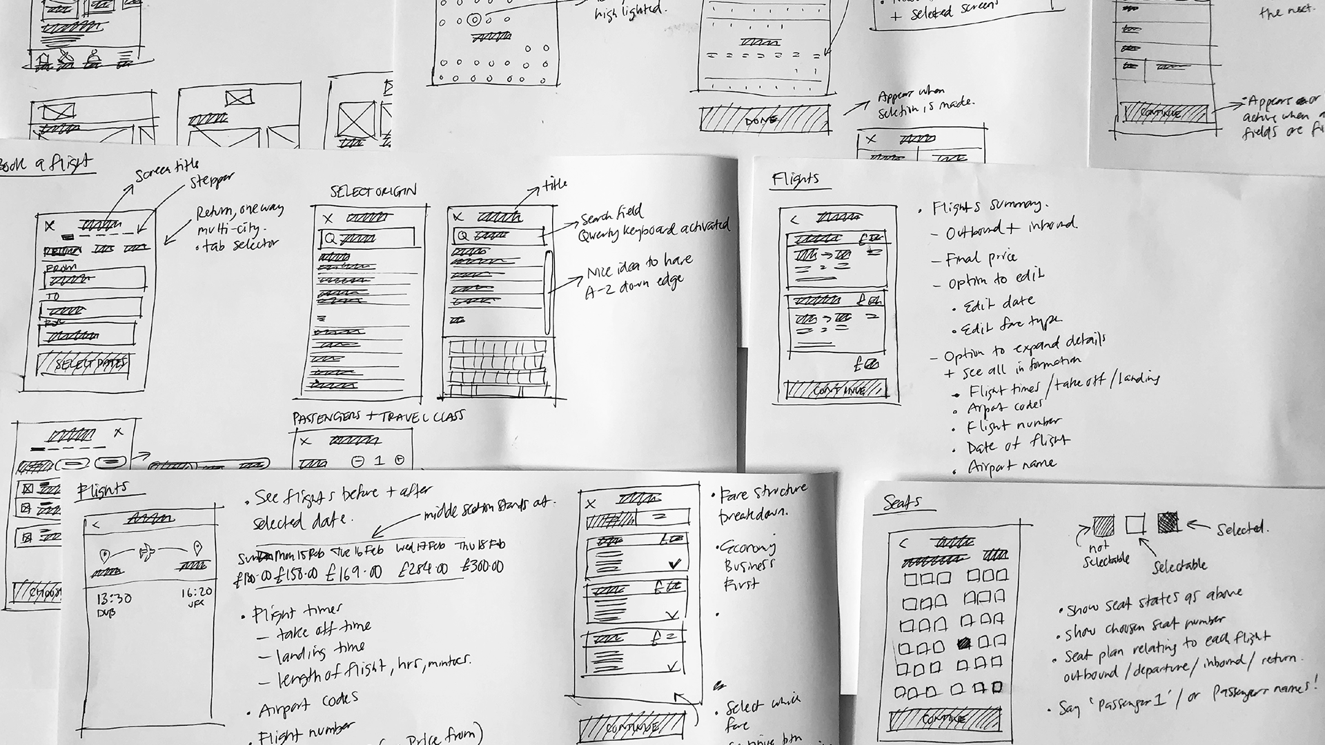
Interaction design
Continuing the design process and starting to solve the problem, I sketched out the screens used for interaction in the app based on the flow diagram. These would be converted later into the prototype and wireframes. Sketching allows for quickly iterating until I was happy with a flow that works.
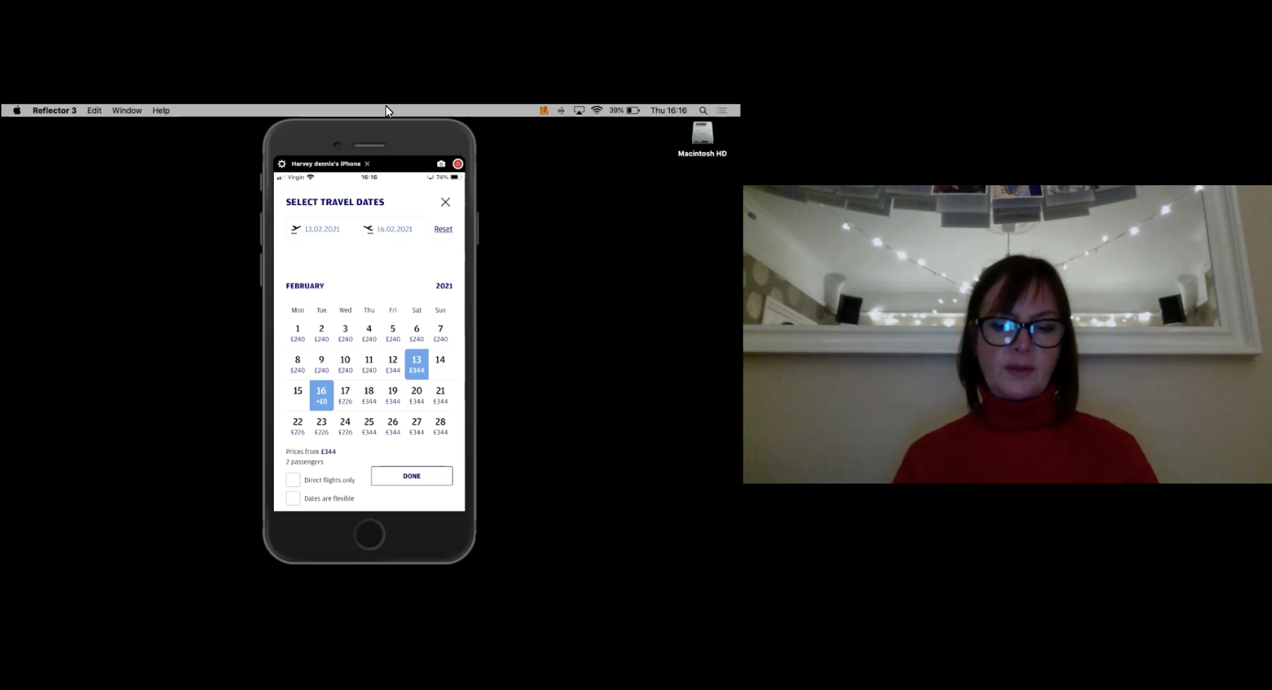
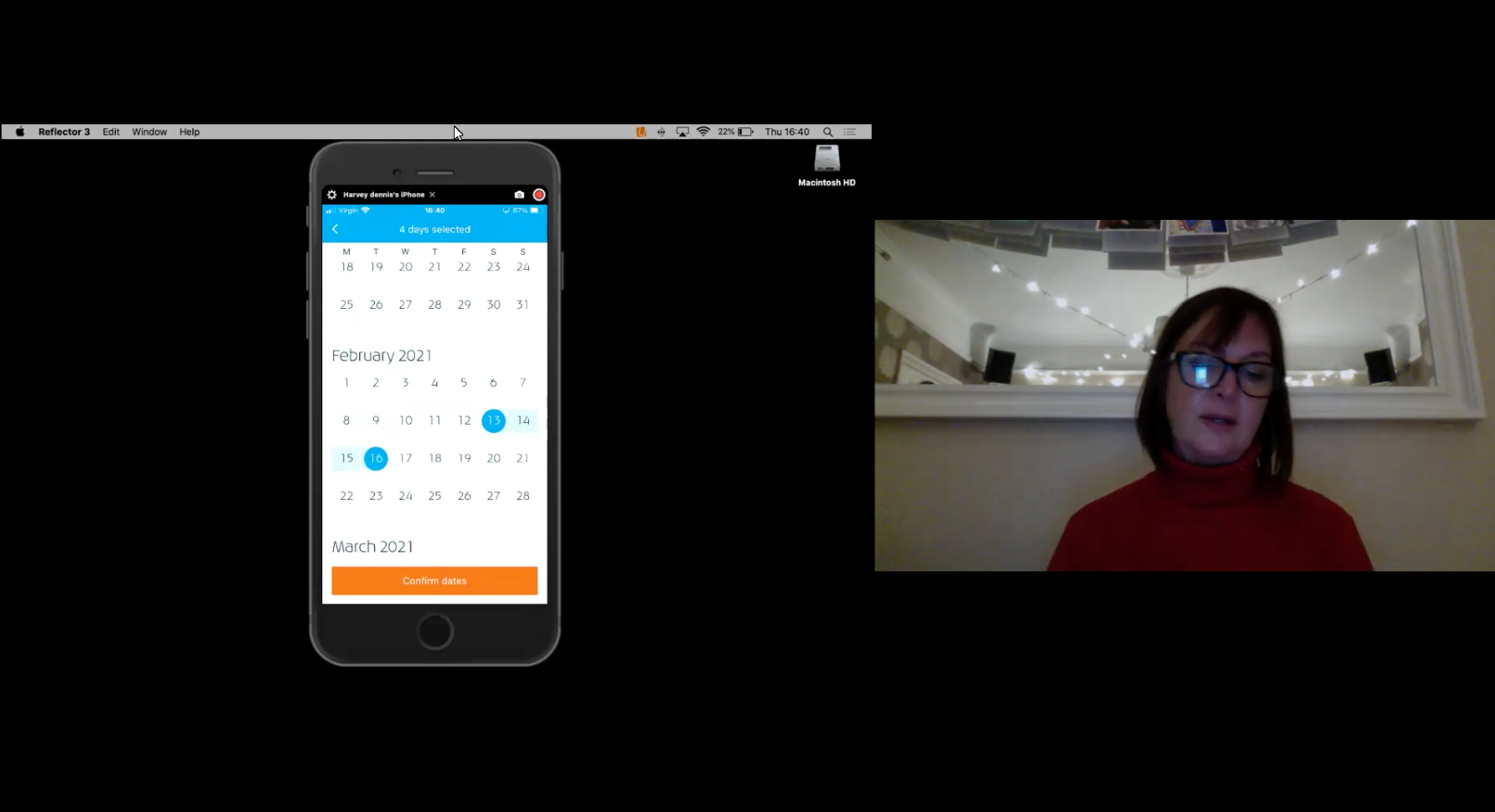
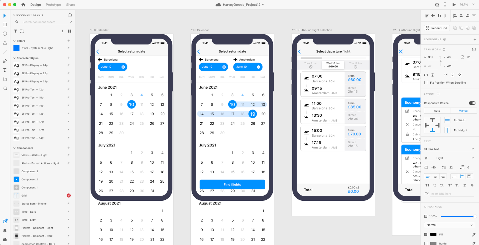
Prototyping
I decided to use the Apple iOS design system, or Human Interface Guidelines (HIG), when building the user flow prototype. Utilising the pre-defined components and guidelines to accelerate the creation of the prototype. This allowed me to concentrate on the apps functionality rather than a branded experience at this stage.
Taking the interaction flow diagram, I moved onto producing a medium fidelity prototype, now adding in more detail in the form of interactivity. I’ve produced prototypes before and know they are ideal to test and validate ideas before sharing them with stakeholders and eventually passing the final designs to engineering teams for the development process.
Try the prototype here. The instructions are:
- Flying from Barcelona to Amsterdam
- x2 passengers
- On June 10 until June 19
- Economy Plus tickets
- Departure seats 8D + 8E
- Return seats 7D + 7E
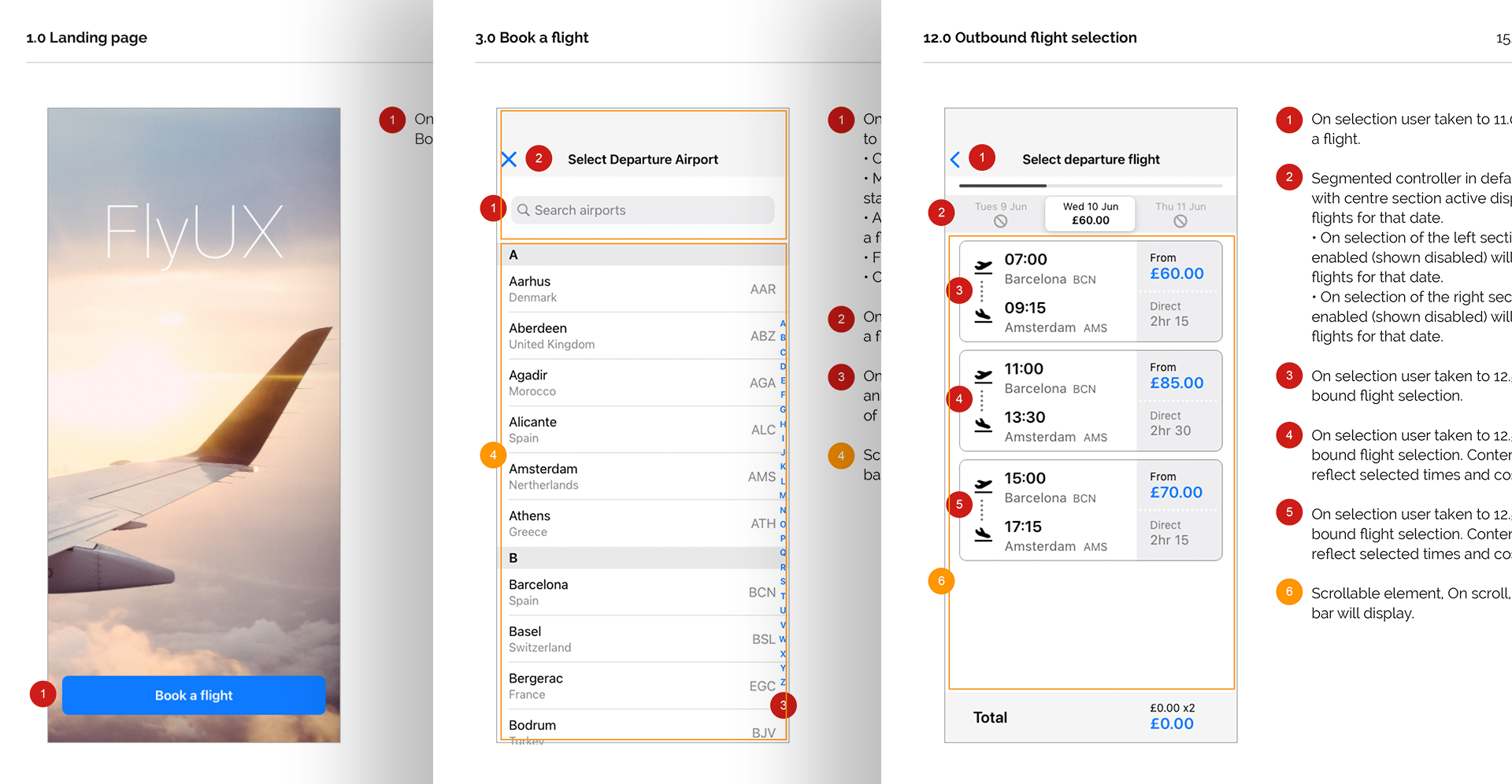
Wireframing
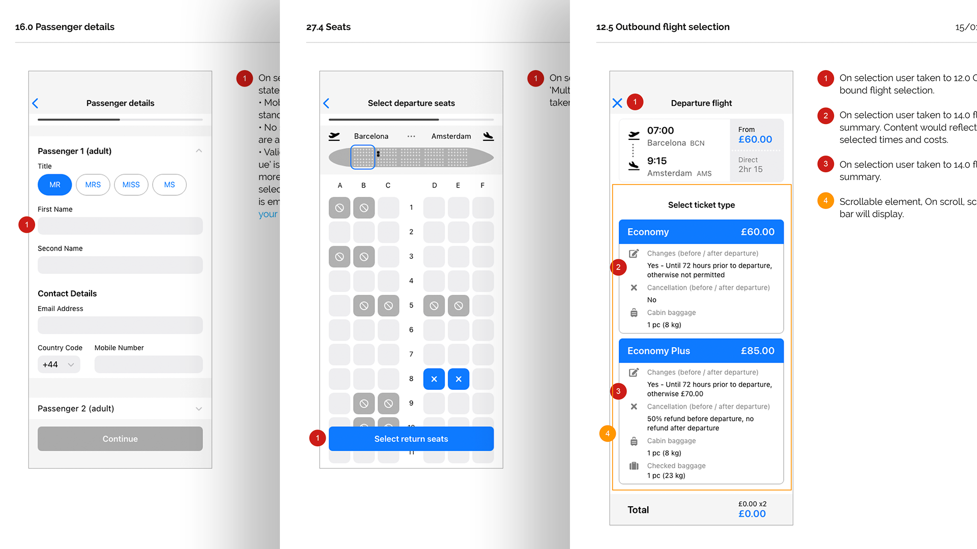
I annotated wireframes from the homepage up to and including seat selection. Documenting the extra details that developers need to build the product accurately. Adding annotations to the wireframes will help explain the design decisions and by adding these annotations to the wireframes, I can communicate my ideas more clearly and helps to get feedback on the designs earlier in the process.
Results
- Understand the iterative user-experience design process to create intuitive and user-friendly products.
- Acknowledge that UX Design aims to address user needs and challenges through technology solutions.
- Recognize the limitations of traditional software development and how UX design offers a more effective approach to mitigate risks and pitfalls.
- Embrace the research-centric nature of UX design, where decisions are informed by insights gathered from studying end-users' behaviors and preferences.
Reflection
My learning never stops but I have learned a vast amount and have been exposed to many aspects of UX that weren’t available to me in any previous working roles. I have gained much from this project and it's given me the confidence to learn and improve new and existing skills. Looking back over the project I can see that during the design phase I should have included more detail in the sketches.
MORE PROJECTS